vigily: brand tokens
The goals behind these choices are in docs/design/brief.md. Tokens are implemented in
crates/vigily-ui/src/index.css; components never use literal colours.
Name
vigily, from vigil: the watch kept through the night while others sleep. vigily records
training runs and evaluations and then keeps watching them: scheduled evals run at 02:00, drift is
checked against a baseline that does not quietly absorb regressions, and an alert is waiting in the
morning. The name says what the product does after you stop looking, which is where it differs from
a run viewer. It is written in lower case everywhere, including at the start of a sentence, like a
command (vigily up).
Subject
ML engineers comparing training runs and evaluation results, for hours, at a desk, in either theme;
and the same engineers the morning after, checking what the night's scheduled evaluations found. Runs
with a status and a duration; hyperparameters; metric series per context (loss on train and
val); datasets with versions; per-item scores; suites with a baseline and a verdict.
Voice and tone
Calm and attentive, like a good night nurse or a lighthouse keeper's log: it notices, states what it saw, and says how sure it is.
- Plain and specific. "exact_match fell from 0.91 to 0.84 on 412 matched items (p = 0.0003)", not "Something looks off!". Numbers carry their unit, their n and, for tests, their p-value.
- Quiet by default. No exclamation marks, no celebration, no alarm words for routine states. A drift verdict is a sentence with evidence, and the evidence is one click away.
- Honest about limits. Say when a test fell back (too few matched items), when data is downsampled, and that the audit export supports record keeping without claiming legal compliance.
- The user's words. Run, metric, dataset, evaluation, schedule, drift, alert, baseline. Never "insights", "magic" or "AI-powered".
- Sentence case in every label and heading; product and command names in lower case.
Mark
vigily keeps watch over runs, evals and drift while you are away; the mark says that directly. It is a pair of binoculars, "keeping watch", beside the plain word.
Binoculars
On a 64 grid, centred on y = 32 and spanning x 6 to 58: two barrels (r 12.5) joined by a bridge, a hinge and a focus wheel, all with round ends; each lens is glass (r 7.5) with a short glint arc.
| Theme | Body | Glass | Glint |
|---|---|---|---|
| light | ink #151719 | ink blue #1F4E8C | white |
| dark | light blue #8DB3EC | deep blue #14304F | #EAE7E0 |
The geometry never changes; only these colours do. At 16 px (the favicon) the drawing fills the tile edge to edge, the glass shrinks to r 6 so the rims stay heavy, and the glint is left out: at that size it is a single stray pixel. Never add an eye, a pupil or a lens flare.
Wordmark
vigily in Recursive Sans Linear (MONO 0, CASL 0) at weight 650, tracking -1 %, outlined, in ink.
Plain letters: the font's own i-dots and the tailed l, no arc and no accent dot. The binoculars sit
centred on the x-height, 9 units before the v.
Icon and lockup
The app tile is the binoculars on a paper tile (64 grid, 14 corner radius), two units below centre; the light tile reads on light and dark browser chrome alike, so the favicon and app tile use it. The apple-touch icon is the same drawing full bleed (iOS rounds the corners). The lockup is the binoculars at 1.5 times the grid, standing on the baseline and reaching the x-height, then the word; it is the app header, the docs header, the README banner and the social card.
Retired marks
- My first identity was an arc wordmark (two i-dots joined by an arc, the last version in teal) and a chart tile (a training curve over a row of eval results, one short). They described the product's objects well, but read as a chart rather than a name, needed three drawings to survive small sizes, and carried the teal the palette has since dropped. I retired them for one object that says "keeping watch" at every size.
- Before those, I drew an eye-with-a-v mark, abstract drift lines, owls and night-watch symbols (moons, stars, towers), and rejected them: they described a mood, not a tracker.
Family
kv0, the storage engine, has a line mark (a ring and rows: "0="); vigily is the application built on it, so it carries a drawn object (the binoculars) beside its wordmark. They share the 64 grid and round caps (kv0 stays on Atkinson Hyperlegible; vigily moved to Recursive); each has its own accent (kv0 cobalt, vigily ink blue). kv0 keeps the cool Slate neutrals. vigily departs from them on purpose: its app uses warm paper neutrals and ink rules (see Colour), because it is read like a report (findings, figures, captions) more than operated like a console. Side by side they read as an engine and the app that runs on it, not as twins.
Files
I checked the marks at the sizes and wordmark heights shown in
docs/assets/explorations.svg.
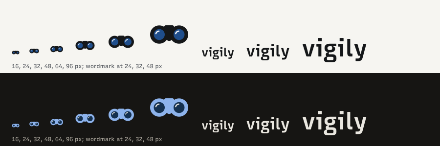
Files. Built by assets/src/build.py from the UI's font files:
logo.svg and logo-dark.svg (the tile, light and dark), icon.svg (the app tile), favicon.svg
(the 16 px drawing), apple-touch-icon.png, wordmark.svg and wordmark-dark.svg (the lockup),
banner-light.svg and banner-dark.svg, social-preview.svg and social-preview.png
(1280 × 640). The web app draws the binoculars from the same geometry with --logo-* tokens
(crates/vigily-ui/src/components/logo.tsx) and the letters from outlines the script writes to
crates/vigily-ui/src/components/wordmark-paths.ts.
Colour
vigily's app uses warm paper neutrals, not kv0's Slate: a deliberate departure, so a page of runs and drift reads like a report printed on paper.
The accent is ink blue: fountain-pen blue on paper. I chose it to replace the earlier sea teal. It sits close to kv0's cobalt, which is fine for an engine and the app built on it; kv0 is unchanged. The dark theme is a warm night (warm near-black paper, warm off-white ink) so it matches the warm paper of the light theme.
colors:            # light            dark
  paper:           ["#F6F5F1",       "#161513"]   # the page
  sidebar:         ["#EFEEE9",       "#1E1D1A"]   # the sidebar, one step off the page
  field:           ["#FBFAF7",       "#1B1A17"]   # inputs, buttons, the search entry
  step:            ["#EEEDE7",       "#26241F"]   # selected rows, rows that differ
  hover:           ["#E8E7E1",       "#2A2823"]   # hovered rows and nav items
  cell:            ["#E2E0D9",       "#312E29"]   # neutral strip cells, the baseline band
  ink:             ["#151719",       "#EAE7E0"]   # text, rules under section heads, primary buttons
  ink-secondary:   ["#55595F",       "#ADA89E"]   # secondary text
  ink-faint:       ["#65686D",       "#948F85"]   # labels, captions, axis ticks
  hairline:        ["#D9D7D0",       "#34312C"]   # every 1 px rule
  control-edge:    ["#8E8C85",       "#6E695F"]   # field borders, >= 3:1 on paper
  ink-blue:        ["#1F4E8C",       "#8DB3EC"]   # good signals only: running, the leader, a gain, best value, focus
  red:             ["#B42318",       "#F08A80"]   # problems only: failed, drift, pass to fail
  warning:         ["#8F5400",       "#E5AE4A"]   # aborted, no heartbeat, moderate input shift
  series:          ["#8E8C85",       "#6E695F"]   # the fourth and later lines, >= 3:1 on paper
  series-strong:   ["#55595F",       "#ADA89E"]   # the third line
  focus:           ink-blue
Measured contrast (WCAG 2), light / dark, on paper and on the sidebar:
ink:            [16.5 / 15.5,  14.8 / 13.7]
ink-secondary:  [6.5 / 6.1,    7.7 / 7.1]
ink-faint:      [5.1 / 4.8,    5.7 / 5.2]     # >= 4.5 everywhere it is used, also on selected rows
ink-blue:       [7.6 / 7.2,    8.5 / 7.9]
red:            [6.0 / 5.7,    7.5 / 6.9]
on ink-blue:    [8.3 (white),  8.5 (#161513)]
series, control-edge: [3.1, 3.3]               # non-text, >= 3:1 on paper
selection bar:  ink blue 8.4 and red 7.4 on #151719; ink blue 6.7 and red 5.3 on #EAE7E0
The dark theme keeps the same restraint: near-black paper, a sidebar one step lighter, hairlines
just visible, ink in a warm off-white, a lighter blue and a softer red. The
selection bar is solid ink in both themes, so it is near-white in dark (the inverse token scope).
Rules. 1.5 px ink under the page header and section heads; 1 px hairlines between rows, figures and around fields. No shadows, gradients, glows or rounded cards; menus and dialogs float on a 1 px ink outline. Flat colour only.
Charts. Editorial, drawn as SVG from the tokens: ink lines, grey for secondary series, ink blue only for
the subject (the leading run). Labels sit at the line ends ("A 0.954"), pushed apart so they never
overlap, instead of a legend. Hairline grid, ink base line, mono tick labels in ink-faint. Every chart
has a numbered caption under a hairline ("Fig. 1" in ink, then what it shows; a measured gap on the
right). Drifted points are red squares; the baseline is a cell band. Strips show one cell per run:
cell within range, red when the run drifted, darker the further below its own baseline. Status is
always a word, never colour alone.
Typography
One variable family for text and code: Recursive (Arrow Type, SIL Open Font License), bundled from fontsource's subset with the MONO and weight axes (no font CDN; the app and the docs work offline and under a strict CSP; about 73 KB for Latin). Settings:
- Text (interface, docs prose): Recursive Sans Linear,
"MONO" 0, "CASL" 0. - Code (run names, values, ids, keys, queries, commands, axis ticks): Recursive Mono Linear,
"MONO" 1, "CASL" 0. - Weights: bold is 660, a step lighter than 700; Recursive turns informal when very heavy. Headings use it with slightly tight tracking (-0.01 to -0.02 em); big figures stay light (300).
- Figures:
tabular-numswherever digits line up (tables, readouts, axes, facts). - Confusables: in Mono, zero is slashed and
1 l Idiffer (flag and foot on1, tailedl, serifedI), so ids and digests read unambiguously; the Sans uses its open zero in prose, and the slashed one wherever text is set in Mono. Checked at 12.5 px.
Why I chose Recursive:
- One family, identical letter shapes. Sans and Mono are one design on a MONO axis, so a run id or a parameter key set in Mono inside a sentence keeps the same letters, weight and x-height as the prose around it; only the widths change. Two families never matched that closely.
- Variable, one file. Text, code, every weight from 300 to 1000 come from one woff2; the wordmark is drawn from the same file (assets/src/build.py), so the logo and the interface agree.
- Character without decoration. The Linear style is plain enough for dense tables, and its slightly squarish curves give vigily a voice of its own; the Casual axis stays at 0.
- What I compared it with: Atkinson Hyperlegible Next and Mono (my previous choice; very legible, but two designs with a visible jump between text and code), IBM Plex Sans and Mono (wider, reads as an enterprise suite), Inter and JetBrains Mono (the default of half the dashboards on the web).
typography:
  text: { family: "Recursive Variable", settings: '"MONO" 0, "CASL" 0', fallback: "ui-sans-serif, system-ui, sans-serif" }
  code: { family: "Recursive Variable", settings: '"MONO" 1, "CASL" 0', fallback: "ui-monospace, SFMono-Regular, Menlo, monospace" }
  scale:
    title:   { size: 26px, weight: 660, lineHeight: 1.1, tracking: "-0.02em" }    # page title, one per page
    figure:  { size: 38px, weight: 300, lineHeight: 1, tracking: "-0.025em" }     # the summary figures
    section: { size: 17px, weight: 660, lineHeight: 1.35, tracking: "-0.015em" }  # section heads over an ink rule
    body:    { size: 14px, weight: 400, lineHeight: 1.5 }                          # prose, controls
    small:   { size: 13px, weight: 400, lineHeight: 1.4 }                          # table cells, facts, meta
    label:   { size: 11px, weight: 660, tracking: "0.1em", case: upper }           # table heads, figure labels, nav groups
  numerals: tabular-nums in every table, readout and axis
  rules:
    - numbers right-aligned in tables, 4 significant digits by default, full value in the tooltip
    - Mono (MONO 1) for run names, values, ids, parameter and metric keys, queries and commands
    - tracked capitals only for the 11 px labels; everything else in sentence case
Shape and depth
radius: 0                     # square fields, buttons, tables and dialogs
elevation: none               # flat; floating layers get a 1 px ink outline and a scrim
spacing: { base: 4px, gutter: [16 phone, 24 desktop], section: 28px above a section head }
density: { row: 42px, toolbar: 52px top bar, control: 36px (44px on coarse pointers) }
Components
- Shell: a 232 px sidebar (wordmark, the repository, nav grouped Track / Evaluate / Workspace with counts; drift and alert counts in red; the current item has a 3 px ink bar), and a sticky top bar with breadcrumbs, the search entry (⌘ K / Ctrl K), Docs and the theme switch. Below 768 px the sidebar becomes a drawer opened from the top bar.
- Page header: title, one line of facts with the figures in bold, actions on the right (outline buttons, one solid ink primary), closed by an ink rule. One finding sits under it as a single summary or alert line (ink-blue tag for a good signal, red square and tag for a problem).
- Figures: four large light numbers with tracked labels and one note each, divided by hairlines; two per row on phones.
- Runs table: dense, virtualised, sticky header and first column, sortable, column picker, a loss sparkline per row on one scale per experiment, an ink-blue star on the best value. Selected rows get their letter in a square and an ink bar. On phones the rows become two lines in their own scroller.
- Selection bar: solid ink along the bottom with the count, the letters, keyboard hints (
ccompare,xtoggle,Escclear) and a paper-coloured "Compare N runs" button. - Compare: a large chart of the headline metric with end labels, the run list in the margin column, a second chart, and a table of only the settings that differ.
- Drift: the score per run with the baseline band, a strip per score, and the items that flipped.
- Buttons: square, flat; primary in solid ink, the rest outlined in hairline. Pending keeps the label and adds a spinner.
- Command palette (⌘ K / Ctrl K): pages, actions, runs, experiments and metrics.
- Icons: lucide at 1.75 stroke, sparingly. No emoji.
Motion
State changes only: 120 ms for hover and press, 160 ms for open and close, cubic-bezier(0.16, 1, 0.3, 1).
The crosshair follows the pointer without easing. prefers-reduced-motion keeps every change and
drops travel.
Browser surfaces
Selection in ink blue at 25 %, caret in ink blue, focus ring 2 px ink blue with 2 px offset, theme-color
and color-scheme follow the theme, scrollbars tinted from ink-secondary, native selects themed.
Principles
- The data is the interface: no decoration a number could replace.
- Colour means focus or state, never identity.
- Everything the pointer can do, the keyboard can do (
/search,j/krows,xselect,ccompare). - The URL is the state: filters, sorts, columns, selected runs and chart settings can be shared.
- Fast first: the first screen renders from one request; charts never ask for more points than pixels.